Profile Styling Tutorial

Is your profile boring and normal?
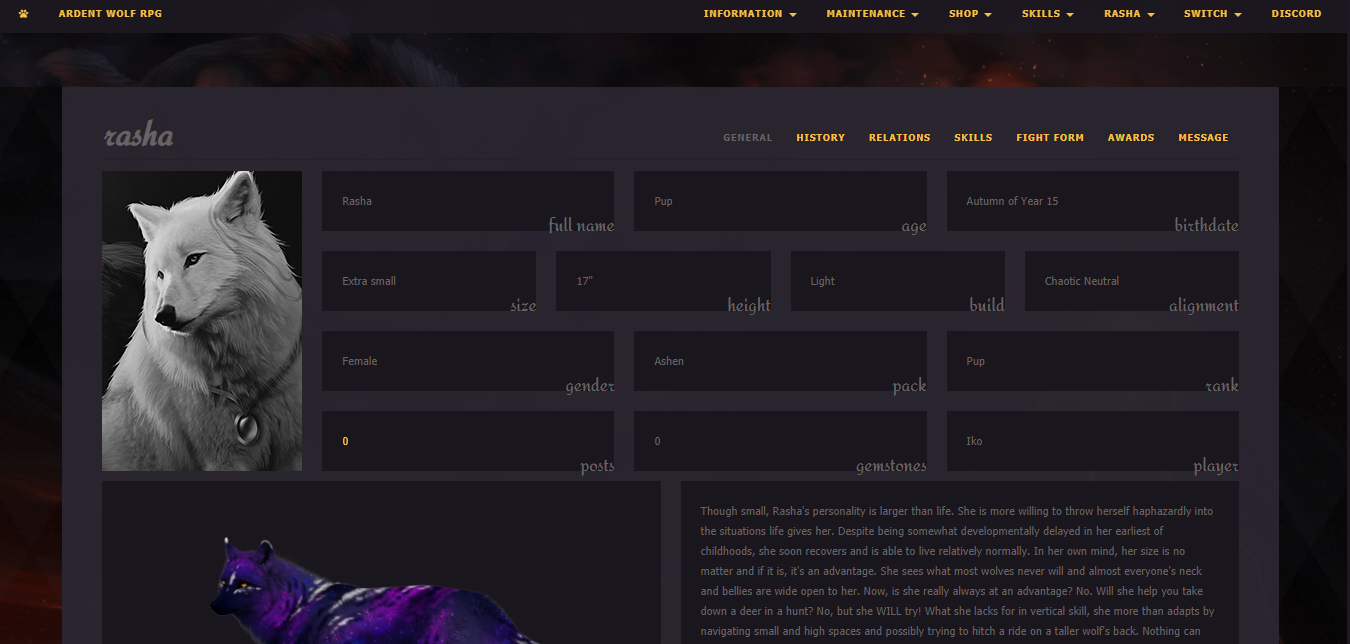
Do you want to have a pretty profile for your pretty character? We can't blame you! Here, we've made a guide to hopefully make your experience as easy as possible!
When you open your User CP, go to Edit Profile, and scroll all the way down, you'll see several sections for editing your profile:
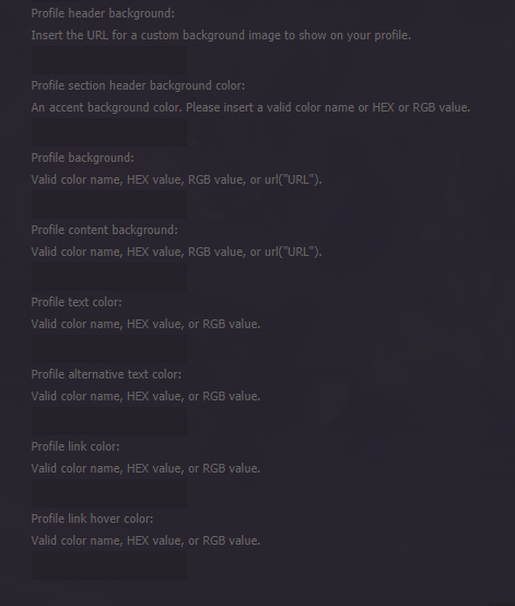
While it may look confusing, it's easy to break down step by step, and we've done all the work for you! The images below will show you what colors change with each section!
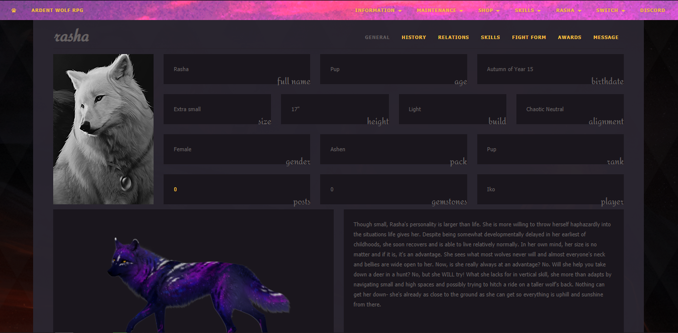
This is what the Profile header background section does. The header will reflect a thin strip of a photo of your choice.
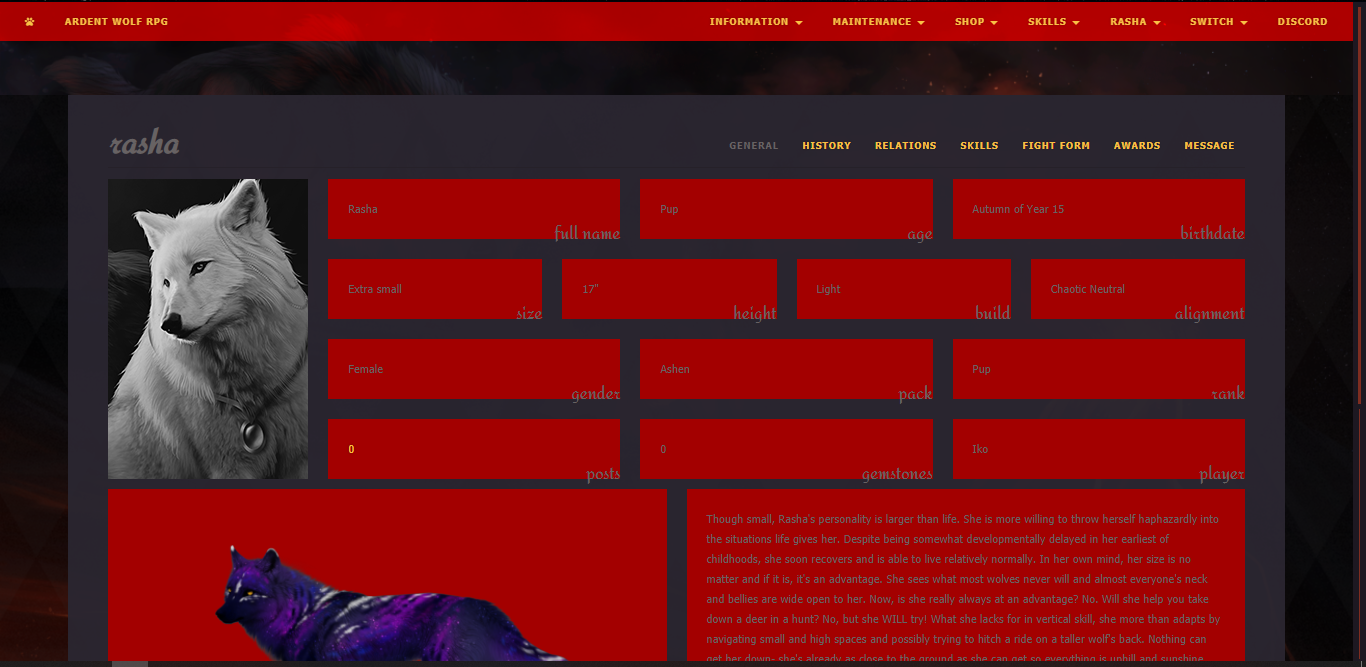
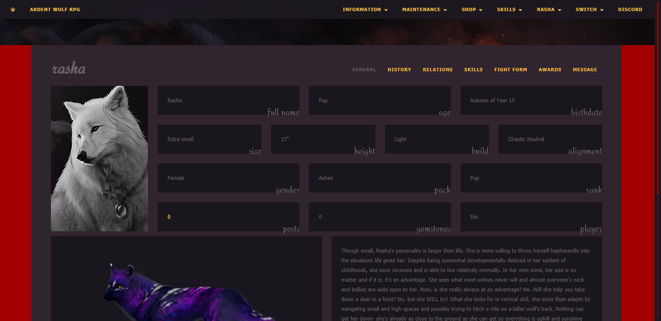
Profile background is exactly what you'd think: it's the background which peers out on either side of the information panel!
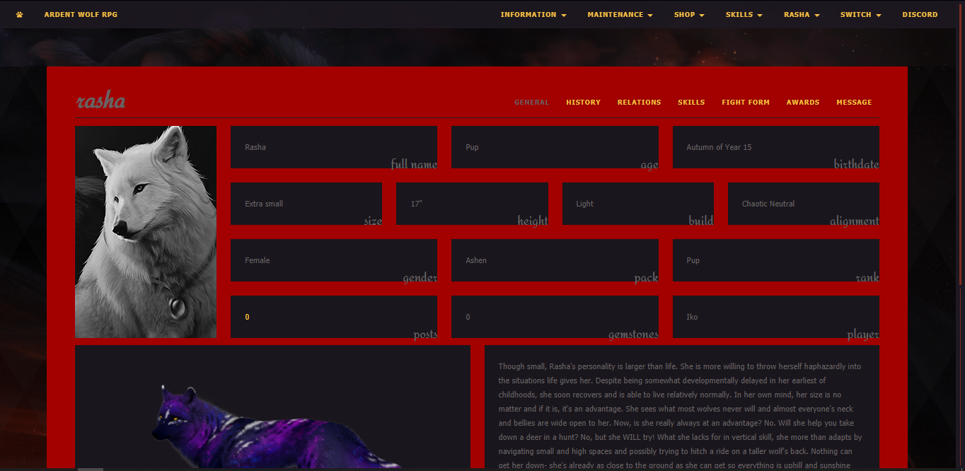
Profile content background is all the space between the profile section headers!
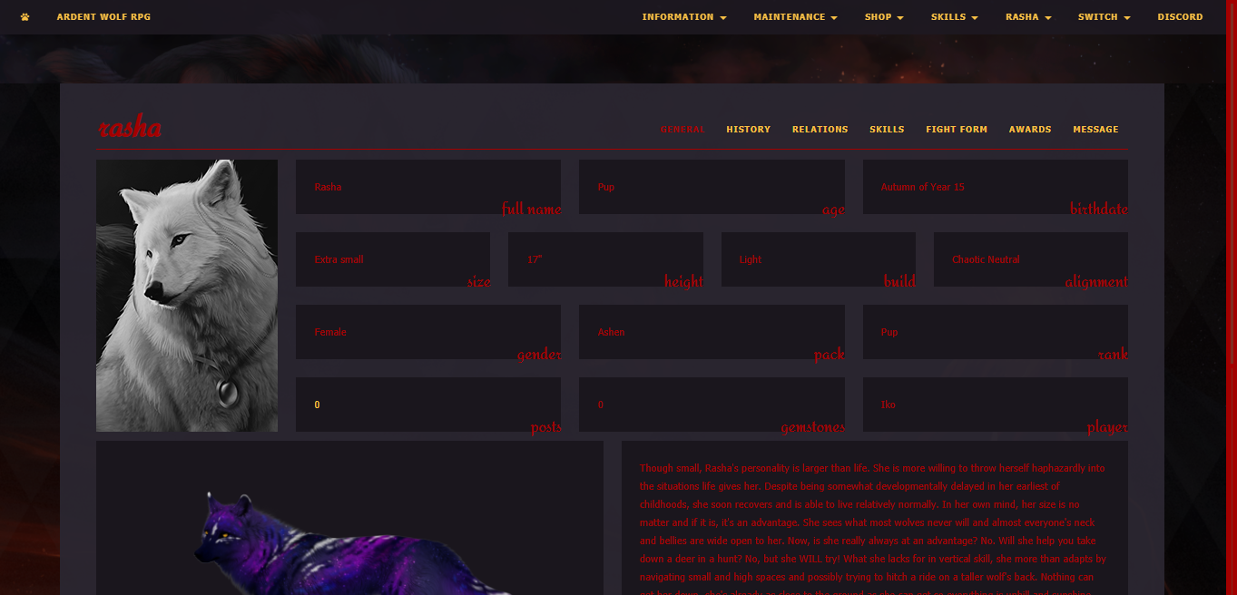
Profile text color is a little self explanatory as it is all the plain text on the page!
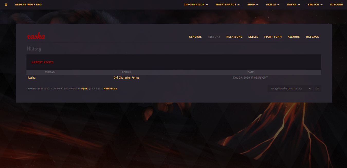
Profile alternative text color is a little harder to nail down, but it's seen best on the history page. It colors your character name and some other alternative text.
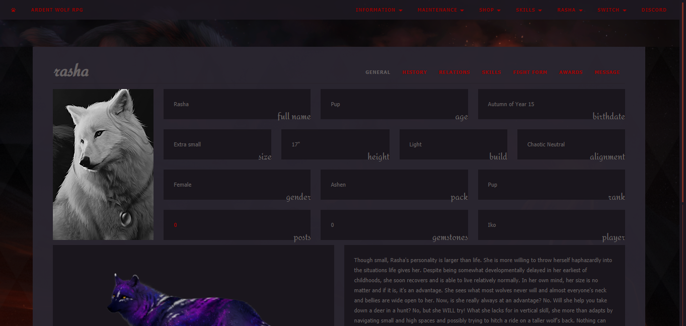
Profile link color handles all clickable links, even on the header!
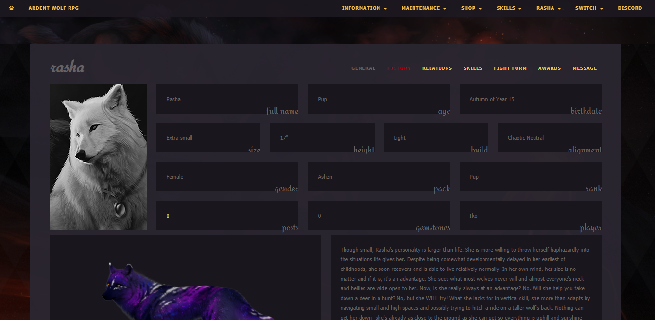
Profile link hover color only shows when you hover over a link! Here we're hovering over the History tab!
Typically I'd avoid super neon colors or mega bright colors on dark backgrounds as they can be difficult on the eyes. Other than that, I like to try to match my character's color theme or whatever feels like them! Feel free to play around.
I like to use sites like https://color.adobe.com/create/image>Adobe or I'll google "color palette from image" to find a selection of colors from there.
When I do profiles I typically think from outer edge to inner. I like to stick to dark-to-light or light-to-dark. Right now, most of my profiles are light-to-dark as seen below:
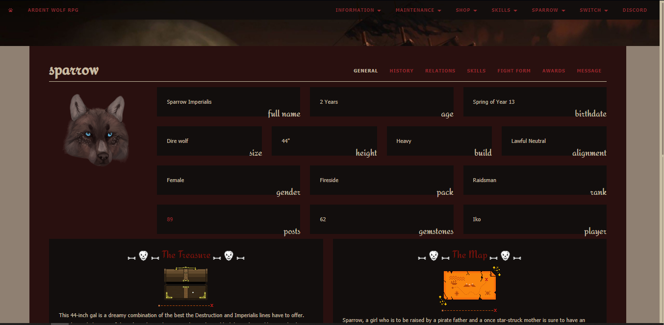
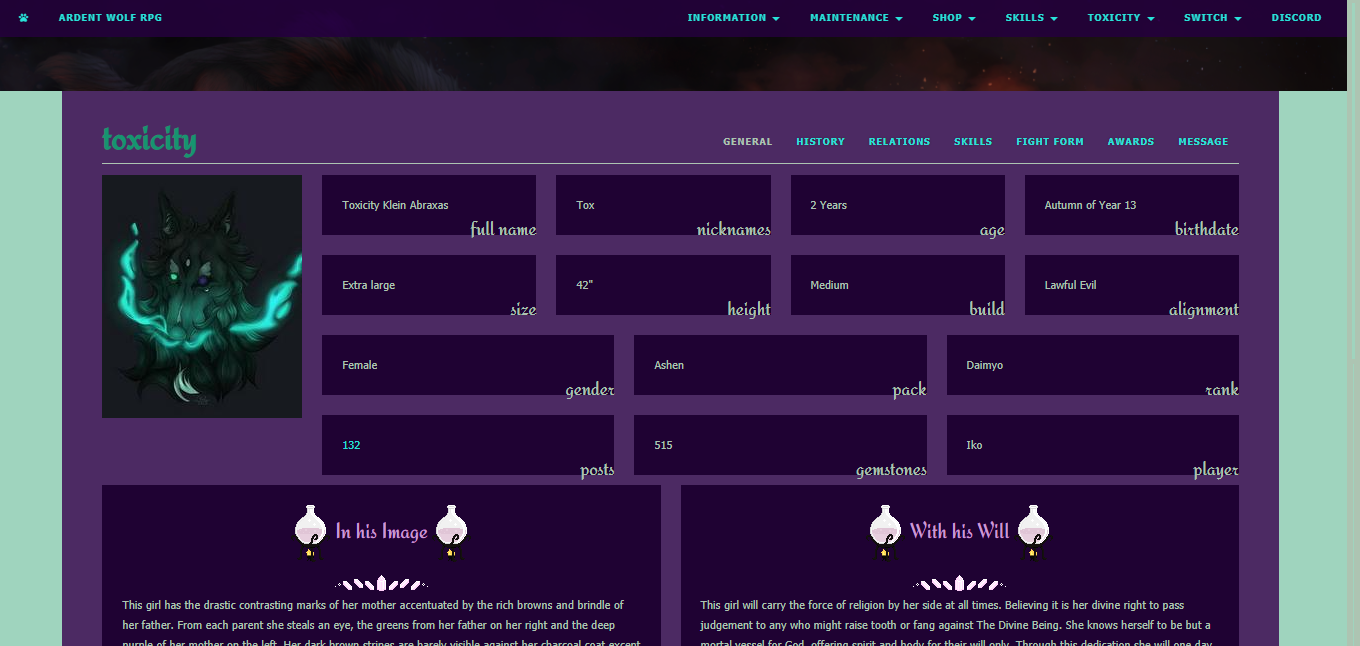
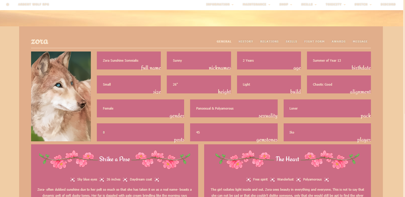
With many of my profiles, I love to make or find F2U (free to use) pixels to add a little flourish! While not needed, they can make your character's profile really stand out. It's like, you already painted the room, now it's time for decoration! I find a lot of mine on sites like DeviantArt. Just make sure they are free to use OFF of DeviantArt as well! Art theft is in no way tolerated on Ardent!
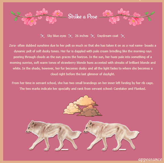
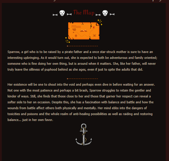
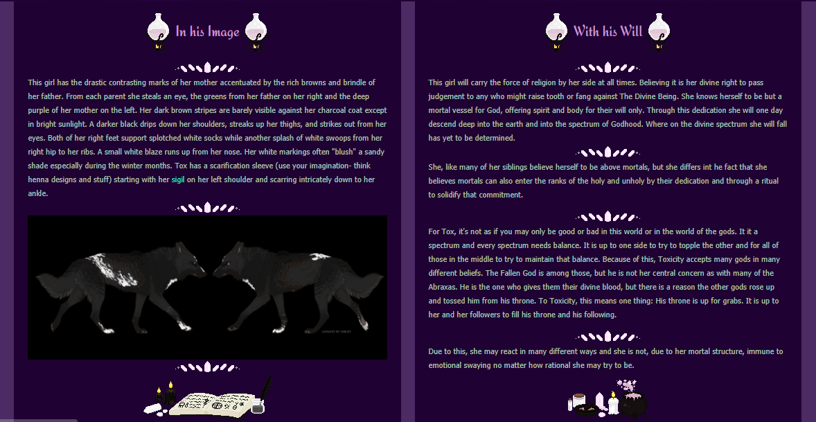
So we have my new girl Rasha. She's super tiny and sneaky. Her coat has a lot of blues and purples. I already know I want to theme her as a ninja of sorts since she's a throwback to a character I made long ago. Let's start by generating a palette from her image.
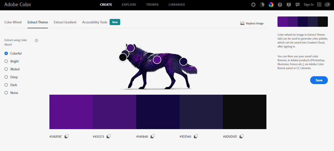
As you can see, there's several settings on the side, but let's try to make a bright profile first. I'll open up my User CP in another tab and work light to dark and see how it looks. I try to match the colors generated to my favorite light-to-dark scheme, but sometimes it takes several tries.
Pro tip: Keep your user CP and your profile open in different tabs so you can update the CP, switch tabs, refresh, and see your profile right away!
This is what we have so far: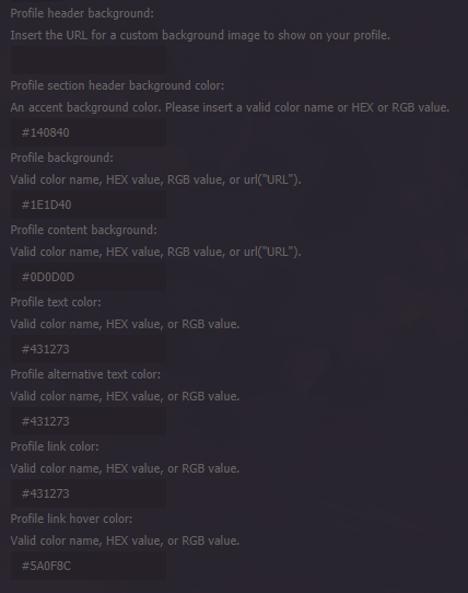
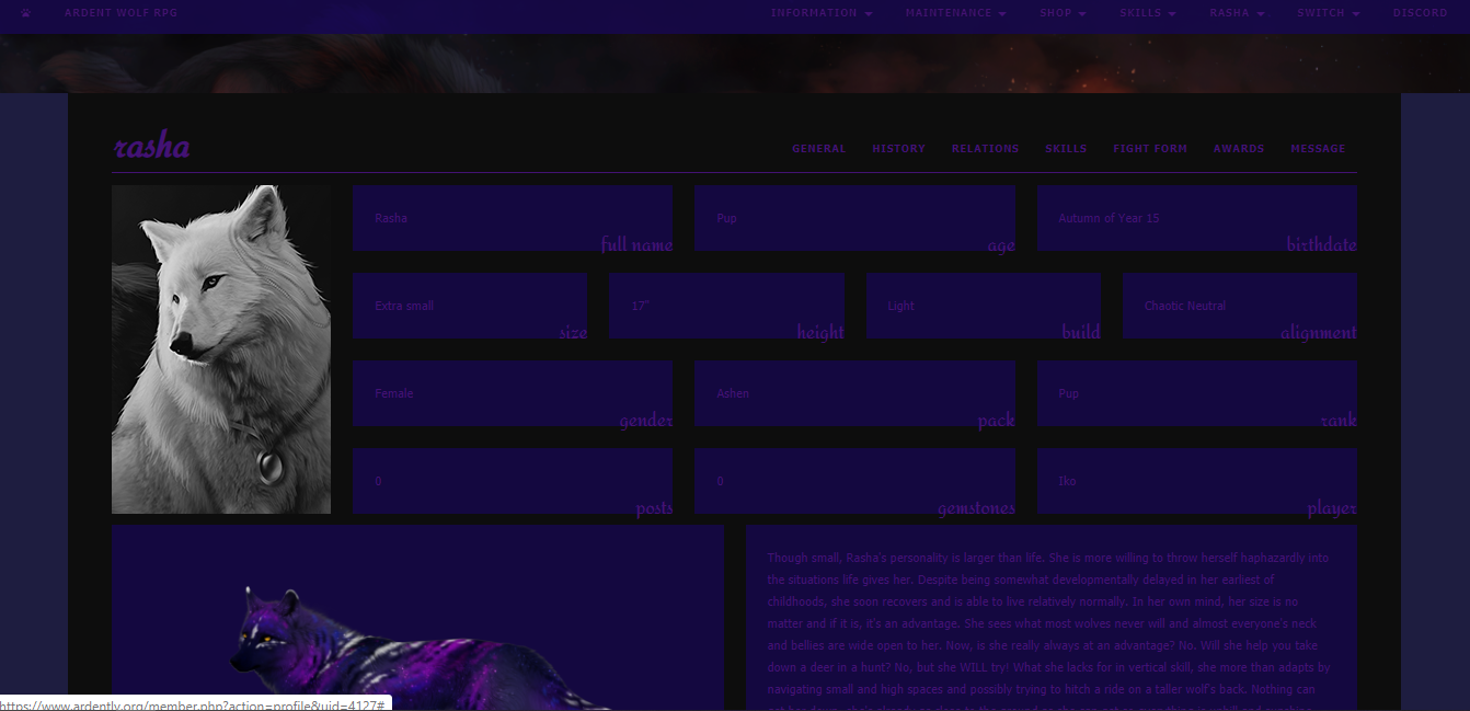
As we can see, the font is a little dark and doesn't really pop. The blue is really saturated and risks being hard to work with, so lets adjust some colors!
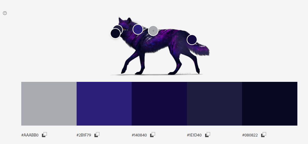
Here I dragged around the dots. You can also enter the colors into an HTML color picker and adjust from there! Now let's plug some of these into the User CP.
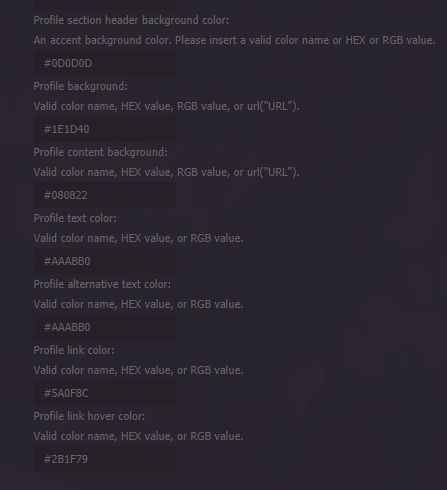
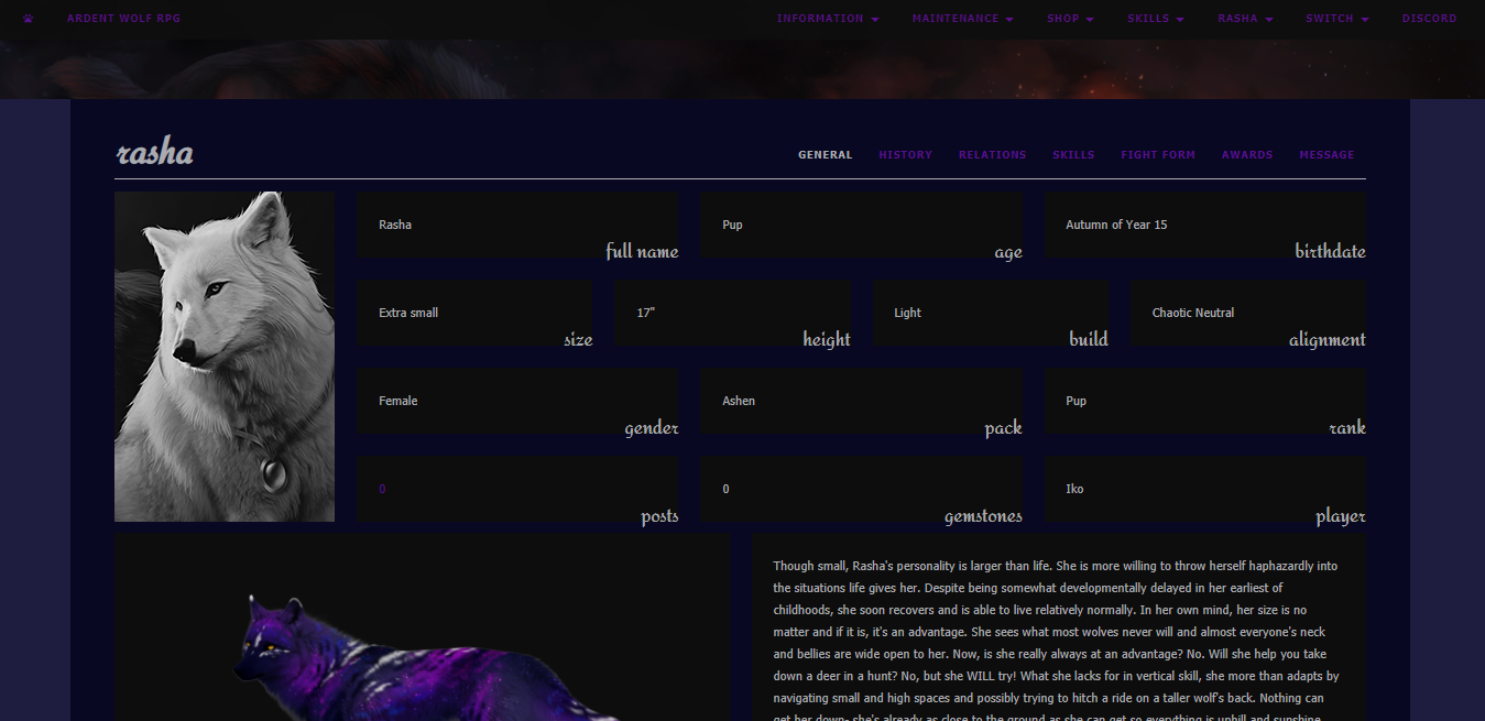
Okay, I'm happy enough with that. Now let's find a header slice image. Because she's a ninja and her profile is darker themed, I think I'll go with a night time or space photo. I'll make sure it's something I have the rights to so that it's not art theft!

Good I'm happy with that! Let's do flourish and finishing touches! I'll search for ninja themed pixels, or night time themed pixels. I look for bullets, dividers, and top/bottom images. Once I have a collection I'll do some flavor text along with the pixels.
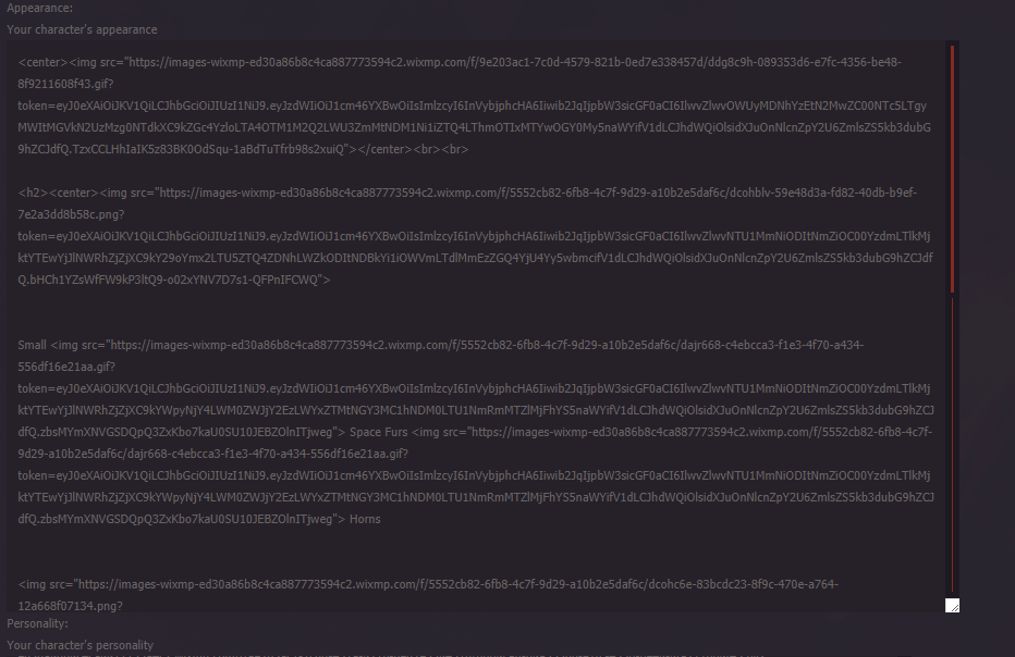
This part is done directly in the boxes you want the pixels to appear such as the Appearance and Personality sections. It can be frustrating as you try to use things like "img src" and "align" and "br" commands, but you really only need to use a few of them. I'd recommend shortening your URLS or else you'll end up with a mess like this:
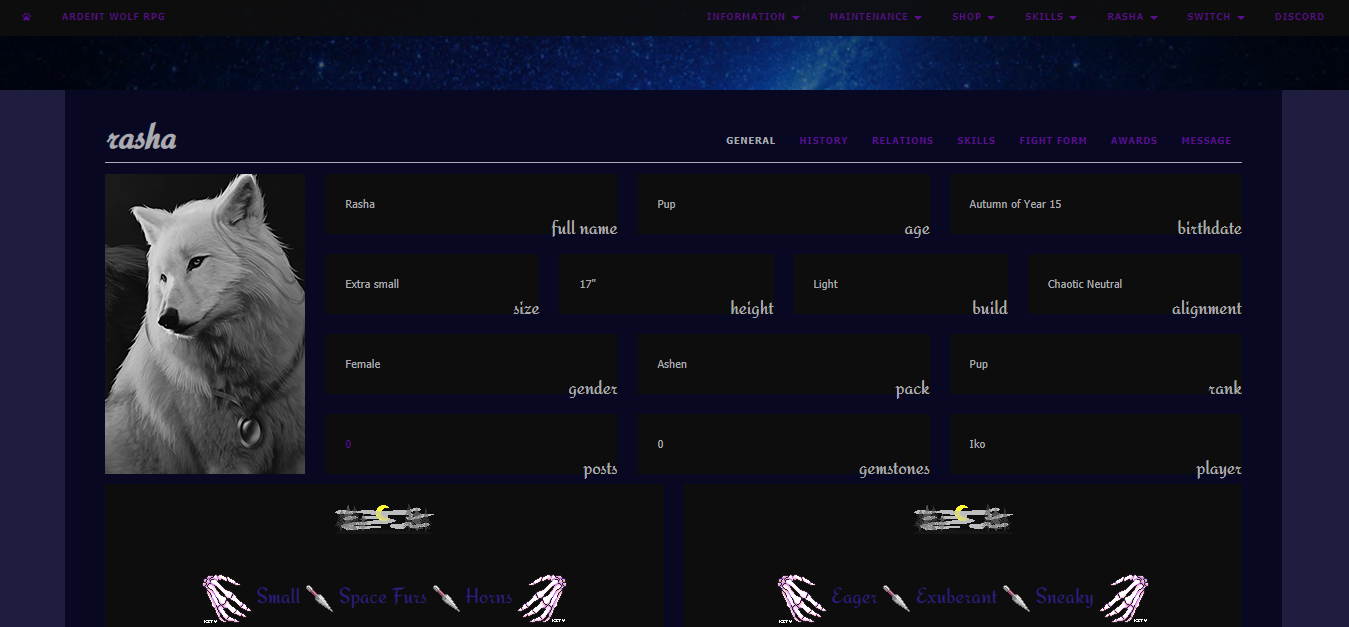
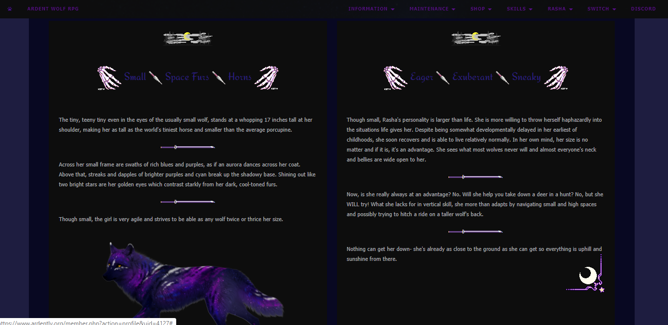
And you've done it! Most of it is learning to just play around, but I know you'll be a a profile making pro in no time!